Design Best Practices for Portals: For a Liferay Portal Theme

 
Tyson Kingsbury / December 10, 2018

In our previous blog post, we discussed Atomic Design, a methodology for creating all the pieces (Atoms) that make up a portal (or app or website). In this blog, we’ll focus closely on how all these pieces are put together to create a Portal design, specifically using Liferay Portal.

A portal, ultimately is made up of a myriad of components (or Atoms). To properly design a portal, all of these must be considered as separate items that need to be considered and designed.  All of them must work together in harmony. The collection of all items will ultimately be your Design Style Guide, from which you can draw on to create all the subsequent pages in your Portal.

In this article, we’ll be dealing with Liferay Portals. The Liferay platform is one of the top portal software platforms on the market, and comes pre-packaged, with all the necessary atoms complete and ready to work. The problem is, they’re all ‘vanilla’ and basic. In order to tailor them to your client or project, you’ll need to revise them.

Here’s a list of the Atoms you’ll need to design:

To get a jump start on these, try downloading the whole set from Lecicondesign.io
They have thoughtfully provided the entire library of components to download as a Figma file (more on the design tool Figma later in this blog)

Badges

Breadcrumbs

Buttons

Cards

Carousel

Close

Code

Colors

Components

Container sizes

Dropdowns

Figures

Form states and alerts

Forms

Grid system

Icons

Jumbotron

Labels

List group

Loaders

Management bar

Media queries breakpoints

Modals

Nameplates

Navbar

Navs

Pager

Pagination

Panels

Pills

Popovers

Progress bars

Scaffolding

Side navigation

Sidebar

Stickers

Tables

Tabs

Thumbnails

Timelines

Toggle card

Toggle switch

Toolbars

Tooltips

Typography

Wells

To begin, let’s start with the initial client meetings you’ll have to determine the breadth and scope of the project. You’ll most likely be looking to pin-point what your starting position will be. Does the client have any current marketing material? Logos and other branding? Chosen fonts and typography? Corporate colours? Photography? All these pieces must be collected and considered in order to build the project.

Let’s assume for the sake of this article, that we’re in a 50/50 position. The client has some key brand elements like photography, fonts, and colours. But is open to the designer creating some of the other items.

From here we can start creating our Atoms.

The colour and the shape:

We’ve now had a chance to go over the clients corporate colours. From here, we can isolate the main colour (for the sake of the article, let’s say it’s blue #2196F3. At this point, we can take that colour into an online app like Paletton, and create a decent colour theme for the entire project.

Now that we have our colour palette, we can begin to create the many components for our project.

A good place to start, for the sake of the article here would be buttons and button states. That would mean, your main ‘action’ buttons, and their different ‘active’ states. On, off, hover, etc.

Another good thing to build at this point, would be a Card Style. Does it have rounded corners? Does it have a stroke? What colour is the stroke?, what thickness? Will there be a drop-shadow? How much shadow? Do we only show a shadow on hover?

These are the types of questions you’ll have to ask yourself as you work on creating all the items. Each piece (or Atom) has to work with the whole. Each piece must be considered, and evaluated on whether it works with all the other pieces.

The collection of all items will ultimately be your Design Style Guide, from which you can draw on to create all the subsequent pages in your Portal.

Figma, and the art of UI/UX design

Back in the day, there was a time when most work like this was done in Photoshop. This lead to a whole myriad of problems when it came time for developer-hand-off. Unless the developer had Photoshop as well (and many did not) they were left with the task of trying to recreate your beautiful design work, using code, and generally going by sight, while looking at a jpeg of your work. This obviously lead to a lot of headaches all around.

Enter Figma.

Figma is an online UI/UX design tool. It operates much in the same way that Photoshop did, but with a few obvious differences. One, it’s ONLINE. A file can be accessed with a simple URL. And two, when a developer selects an item, they can view all the CSS code they want, and easily copy it straight into their code database. This, right here, shows the significant difference between Photoshop and Figma. In Photoshop, you’re make a ‘picture’ of the thing. In Figma, you’re making the ‘actual’ thing.

Once you’ve designed an Atom in Figma, you have, essentially, the finished piece that’s ready to be included in your developers code base.

Figma to Liferay.

Let’s skip to another part of the problem, Liferay Integration.

Liferay is a leading portal software platform for Enterprise, and it has a robust array of tools and items available to developers so that they can create just about anything a designer has imagined.

Once you’ve gone through the list of Atoms that you need to create for your Portal project, you still have the issue of ‘As a designer, do ‘I’ now need to create the code for these pieces? Or can i just hand off the designs?

Well, you can absolutely send the Figma url. That will give any developer exactly what they need to recreate all your atoms.

However…

If you wanted to take things to the next level. You could do it yourself.

Liferay Lexicon Customizer

Introducing a handy little application called ‘Liferay Lexicon Customizer’.

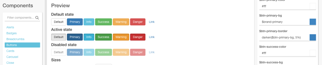
This Application (available for download at Github) is a collection of all the Atoms needed to create a fully functioning Design Guideline. It’s all there, buttons, cards, fonts, etc. Everything you could possibly need is right at your fingertips.

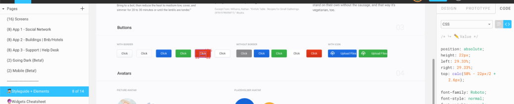
Using the code section on Figma, you can see all the relevant code needed to recreate this in the Customizer. You’ll see size, hex colours, fonts, drop shadow information, and so forth.

By going through each of these atoms, one at a time, you’re creating the codebase that liferay needs, in order to create your new ‘theme’

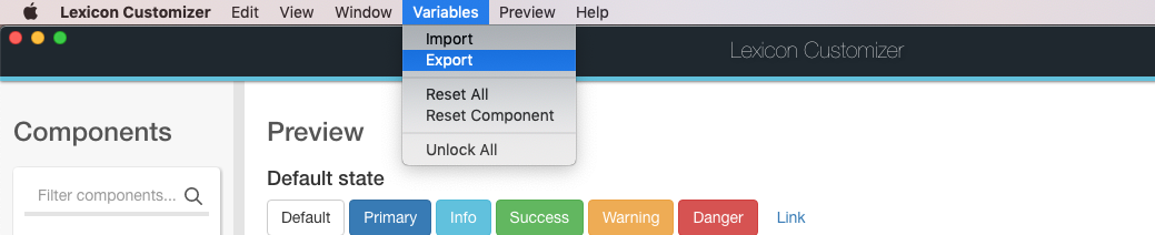
When you’ve gotten to the last atom on your list, you can simply ‘export’ the full works, and hand over the .scss file to your developer.

Of course, in the end, this is just the creating and exporting of all your Atoms. There is still and always will be the task of designing the page flow and overall layouts of the Portal Itself. For this task, standard design and page layout skills (along with an understanding of UX, and your customers business practices) will be your chief ally.

Sign up below for our newsletter, if you’d like to receive our newsletter.

Contact Us